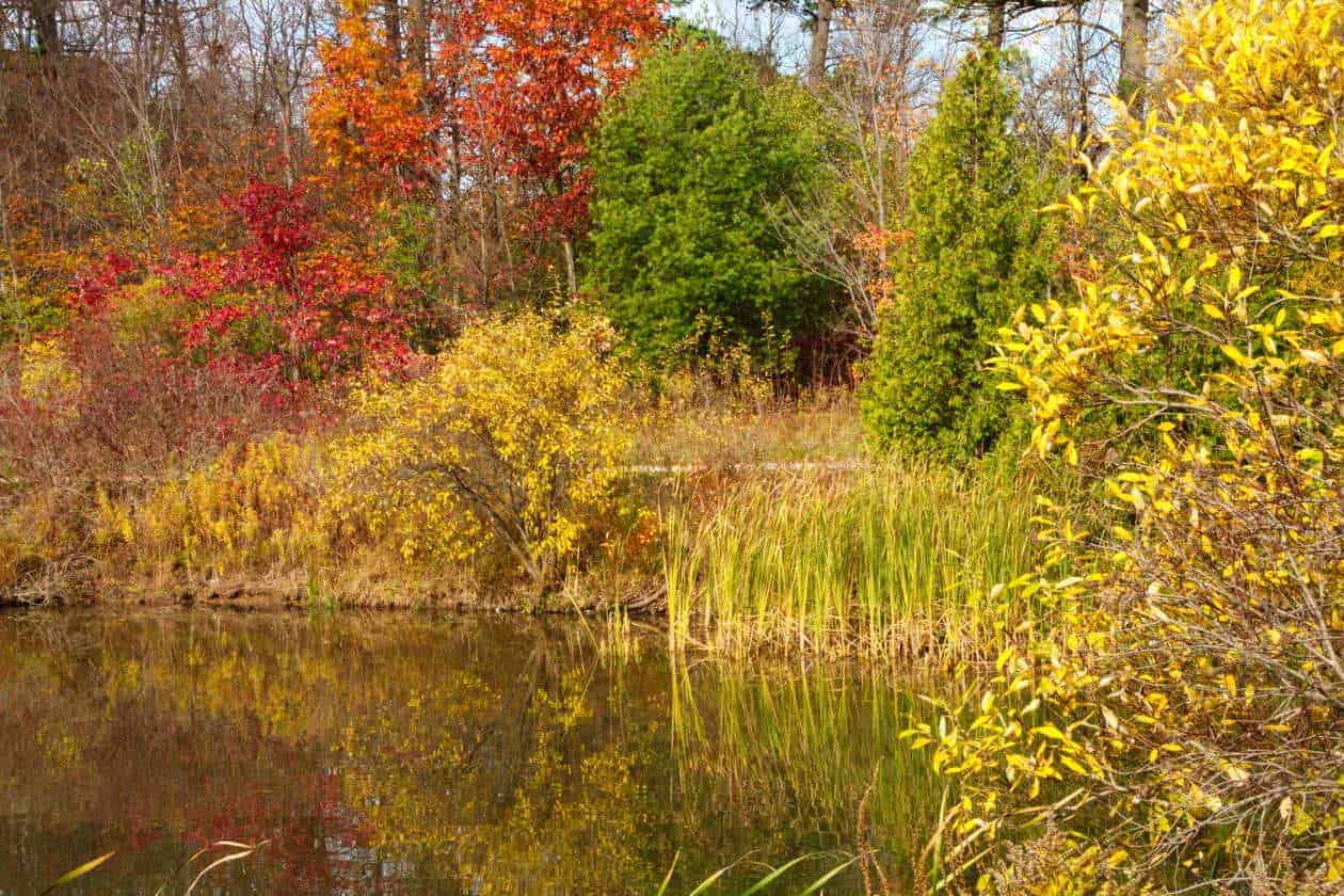
Fall came late this year around here, and until the first week of November, there wasn’t any really cold weather. It seemed to me that some trees dropped their leaves early and there was very little red to be found around Oakville. On November 7 I had my P7100 in my pocket, just in case, and the local heron was posing nicely on the far side on the pond. Without much reach on the zoom, I went with a “riot of colour with a heron near the intersection of the one-third lines. Here are some of the images from that walk.
For those of you who are interested in such things, after the image gallery I’ll share how I used ACDSee to change the images to enhance the colours, and better approximate on a screen what I remember seeing in real life!


Adjusting the images using ACDSee software
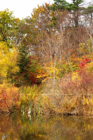
The photos as they came off the camera were nothing much, as you can see in the first photo below, but as soon as I adjusted the images in ACDSee’s develop mode, using tone curve, they began to pop.

I started as I always do with redistributing the pixels across all 255 levels rather than the compressed scale that was recorded. That sounds complicated, but all I did was press “auto”.
That was better, but you probably wouldn’t see much difference – it’s more effective seeing the change happen as you make them! Next I tinkered with the tone curve.
It starts as a straight line, but we want to alter it so the that dark tones are darker, the middle tones stay pretty much the same and the light tones (highlights) are lighter. The overall effect is to increase contrast. the difference between the darkest parts and the lightest parts is increased. In practice, determining where to place a point and how far to move it off the diagonal is a combination of experience and trial and error, but as the errors happen in real-time, they are easy to fix! Drag things around until it looks better and not artificial. The latter is probably my biggest problem as my eyes see colours as pastels rather than oil paint, so to speak, so when I adjust to get what looks striking to me, it may be overpowering to others, so I try to back off a bit. Maybe I don’t always try hard enough!
Anyway, here’s the adjustments I thought were appropriate for this image:
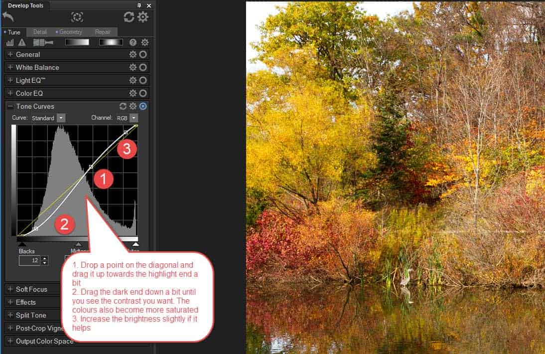
On these photos, I deemed this to be enough. It’s a shame the sky was overcast- a bright blue sky lifts most images, but on the other hand, if it had been that kind of day, the overall light would have been harsh. I did try masking the sky and adding a blue effect, but it wasn’t a natural look, so I discarded that edit.
I hope you enjoyed this peek behind the scenes!